It is easy to identify an ad you don’t like, but its hard to identify why you like an ad.
We have seen a lot of ads come through PizzaNotes.com, and below are some tips to make or break your ad campaign. Check out the five tips below for creating a money-making ad.

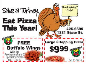
A good headline will grab your customers attention straight away. Some of the best headlines do this by conveying value or using humor. This ad clearly states the value in the headline.
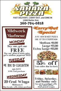
Most advertisers will want a picture somewhere in their ad. It goes without saying that the photo should look desirable, but what some people don’t know is that the picture should be taken at an angle (as opposed to straight on). This creates visual appeal by adding dimension in the ad. You can take it a step further by incorporating a shadows. Another way to add appeal when using an image is to feather the edges so it blends into the note. We use this technique when we don’t want a picture to be the central focus of an ad, but an enhancer.
As a general guide, try to use colors that are in your logo. Also, use colors that people can identify with. For instance, red and green are associated with Italian food or with pizza. Use of these colors in an ad can help identify your ad instantly.
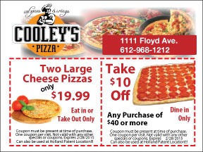
The most common call to action on a sticky note is a coupon. The side benefit of including a coupon, is it enables you to measure the success of an ad. A good offer includes a monetary discount or something for free with purchase. Always include a deadline, to get people to make a decision to visit your establishment immediately so they don’t miss out on the deal. Another tip to get them in the door is to offer some bonus like a free soda or breadsticks to the first 50 people to use the coupon or for people who use the coupon on a certain day (for instance, your slow day).
When designing an ad, I often do a squint test to see if the ad is balanced graphically and where the central focus is. Typically, the top third is where a person’s eye is drawn to, but you can influence that by creating a dominate, visual interest point somewhere on your note. How do you do that? By using a colorful image or a catchy headline.
